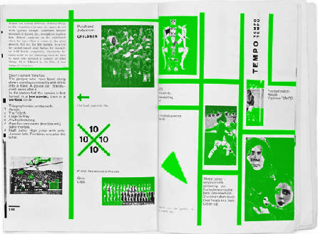
“TYPOPHOTO TYPOPHOTO TYPOPHOTO“
Graphic design theory Graphic design theory Graphic design theory Graphic design theory Graphic design theory Graphic design theory

TYPOPHOTO
Neither curiosity nor economic considerations alone but a deep human interest in what happens in the world has brought about the enormous expansion of the news service: typography, the film, and the radio.
The creative work of the artist, the scientist’s experiments, the calculations of the businessman or the present-day politician, all that moves, all that shapes, is bound up in the collectivity of interacting events. The individual’s immediate action of the moment always has the effect of simultaneity in the
long term. The technician has his machine at hand: satisfaction of the needs of the moment. But basically much more: he is the pioneer of the new social stratification, he paves the way for the future.
The printer’s work, for example, to which we still pay too little attention, has just such a long-term effect: international understanding and its consequences.
The printer’s work is part of the foundation on which the new world will be built. Concentrated work of organization is the spiritual result that brings all elements of human creativity into a synthesis: the play instinct, sympathy, inventions, economic necessities. One man invents printing with movable
type, another photography, a third screen printing and stereotype, the next electrotype, phototype, the celluloid plate hardened by light. Men still kill one another, they have not yet understood how they live, why they live; politicians fail to observe that the earth is an entity, yet television (Telehor) has been
invented: the “Far Seer”—tomorrow we shall be able to look into the heart of our fellow man, be everywhere and yet be alone; illustrated books, newspapers, magazines are printed—in millions. The unambiguousness of the real, the truth in the everyday situation, is there for all classes. The hygiene of the
optical, the health of the visible is slowly filtering through.
What is typophoto?
Typography is communication composed in type. Photography is the visual presentation of what can be optically apprehended. Typophoto is the visually most exact rendering of communication. Every period has its own optical focus. Our age: that of the film; the electric sign, simultaneity of sensorially perceptible events. It has given us a new, progressively developing creative basis for typography, too. Gutenberg’s typography, which has endured almost to our own day, moves exclusively in the linear dimension. The intervention of the photographic process has extended it to a new dimensionality, recognized today as total. The preliminary work in this field was done by the illustrated papers, posters, and by display printing.
Until recently typeface and typesetting rigidly preserved a technique that admittedly guaranteed the purity of the linear effect but ignored the new dimensions of life. Only quite recently has there been typographic work that uses the contrasts of typographic material (letters, signs, positive and negative values of the plane) in an attempt to establish a correspondence with modern life. These efforts have, however, done little to relax the inflexibility that has hitherto existed in typographic practice. An effective loosening up can be achieved only by the most sweeping and all-embracing use of the techniques of photography, zincography,
the electrotype, etc. The flexibility and elasticity of these techniques bring with them a new reciprocity between economy and beauty. With the development of phototelegraphy, which enables reproductions and accurate illustrations to be made instantaneously, even philosophical works will presumably use the
same means—though on a higher plane—as the present-day American magazines. The form of these new typographic works will, of course, be quite different typographically, optically, and synoptically from the
linear typography of today. Linear typography communicating ideas is merely a mediating makeshift link between the content of the communication and the person receiving it:
COMMUNICATION — TYPOGRAPHY — PERSON
Instead of using
typography—as hitherto—merely as an objective means,
the attempt is now being made to incorporate it and the potential effects of its subjective existence creatively into the contents.
The typographical materials themselves contain strongly optical tangibilities by means of which they can render the content of the communication in a directly visible—not only in an indirectly intellectual—fashion. Photography is highly effective when used as typographical material. It may appear as illustration beside the words, or in the form of “phototext” in place of words, as a precise form of representation so objective as to permit of no individual interpretation. The form, the rendering, is constructed out of the optical and associative relationships: into a visual, associative, conceptual, synthetic continuity:
into the typophoto as an unambiguous rendering in an optically valid form.
The typophoto governs the new tempo of the new visual literature.
In the future every printing press will possess its own block-making plant, and it can be confidently stated that the future of typographic methods lies with the photomechanical processes. The invention of the photographic typesetting machine, the possibility of printing whole editions with X-ray radiography, the new cheap techniques of block making, etc., indicate the trend to which every typographer or typophotographer must adapt himself as soon as possible.
This mode of modern synoptic communication may be broadly pursued on another plane by means of the kinetic process, the film.
33
I said before.
26
Airplane.
It means typo-photo-grapher
In this way the automatism of the present-day book will be overcome;
34
THE NEW TYPOGRAPHY
into something that our minds can grasp as an organized unity.
The essence of the New Typography is clarity. This puts it into deliberate opposition to the old typography whose aim was “beauty” and whose clarity did not attain the high level we require today. This utmost clarity is necessary today because of the manifold claims for our attention made by the extraordinary amount of print, which demands the greatest economy of expression. The gentle swing of the pendulum between ornamental type, the (superficially understood) “beautiful” appearance, and “adornment” by extraneous additions (ornaments) can never produce the pure form we demand today. Especially the feeble clinging to the bugbear of arranging type on a central axis results in the extreme inflexibility of contemporary typography.
In the old typography, the arrangement of individual units is subordinated to the principle of arranging everything on a central axis. In my historical introduction I have shown that this principle started in the Renaissance and has not yet been abandoned. Its superficiality becomes obvious when we look at Renaissance or baroque title pages. Main units are arbitrarily cut up: for example, logical order, which should be expressed by the use of different type sizes, is ruthlessly sacrificed to external form. Thus the principal line contains only three-quarters of the title, and the rest of the title, set several sizes smaller, appears in the next line. Such things admittedly do not often happen today, but the rigidity of central-axis setting hardly allows work to be carried out with the degree of logic we now demand. The central axis runs through the whole like an artificial, invisible backbone: its raison d’être is today as pretentious as the tall white collars of Victorian gentlemen. Even in good central-axis composition the contents are subordinated to “beautiful line arrangement.” The whole is a “form” that is predetermined and therefore
must be inorganic.
We believe it is wrong to arrange a text as if there were some focal point
in the center of a line
that would justify such an arrangement.
Such points of course do not exist, because we read by starting at one side (Europeans for example read from left to right, the Chinese from top to bottom and right to left). Axial arrangements are illogical because the distance of the stressed, central parts from the beginning and end of the word sequences is not usually equal but constantly varies from line to line.
But not only the preconceived idea of axial arrangement but also all other preconceived ideas—like those of the pseudo-Constructivists—are diametrically opposed to the essence of the New Typography. Every piece of typography that originates in a preconceived idea of form, of whatever kind, is wrong. The New Typography is distinguished from the old by the fact that its first objective is to develop its visible form out of the functions of the text. It is essential to give pure and direct expression to the contents of whatever is printed; just as in the works of technology and nature, “form” must be created out of function. Only then can we achieve a typography that expresses the spirit of modern man. The function of printed text is communication, emphasis (word value), and the logical sequence of the contents.
36
almost


reason or justification for existence
35
BUCHVERTRIEB
DAS POLITISCHE BUCH

It means typo-photo-grapher
Every part of a text relates to every other part by a definite, logical relationship of emphasis and value, predetermined by content. It is up to the typographer to express this relationship clearly and visibly through type sizes and weight, arrangement of lines, use of color, photography, etc. The typographer must take the greatest care to study how his work is read and ought to be read.
[ . . . ]
Working through a text according to these principles will usually result in a rhythm different from that of former symmetrical typography. Asymmetry is the rhythmic expression of functional design. In addition to being more logical, asymmetry has the advantage that its complete appear-ance is far more optically effective than symmetry.
Hence the predominance of asymmetry in the New Typography. Not least, the liveliness of asymmetry is also an expression of our own move -ment and that of modern life; it is a symbol of the changing forms of life in general when asymmetrical movement in typography takes the place of symmetrical repose. This movement must not, however, degenerate into unrest or chaos. A striving for order can, and must, also be expressed in asymmetrical form. It is the only way to make a better, more natural order possible, as opposed to symmetrical form, which does not draw its laws from within itself but from outside.
Furthermore, the principle of asymmetry gives unlimited scope for variation in the New Typography. It also expresses the diversity of modern life, unlike central-axis typography, which, apart from variations of typeface (the only exception), does not allow such variety.
While the New Typography allows much greater flexibility in design, it also encourages “standardization” in the construction of units, as in building.
The old typography did the opposite: it recognized only one basic form, the central-axis arrangement, but allowed all possible and impossible construc-tion elements (typefaces, ornaments, etc.).
The need for clarity in communication raises the question of how to achieve clear and unambiguous form.
Above all, a fresh and original intellectual approach is needed, avoid-ing all standard solutions. If we think clearly and approach each task with a fresh and determined mind, a good solution will usually result.
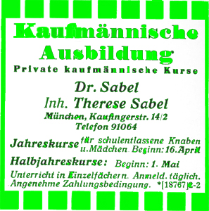
The most important requirement is to be objective. This, however, does not mean a way of design in which everything is omitted that used to be tacked on, as in the letterhead “Das politische Buch” shown here [see p. 37]. The type is certainly legible and there are no ornaments whatever. But this is not the kind of objectivity we are talking about. A better name for it would be “meagerness.” Incidentally this letterhead also shows the hollowness of the old principles: without “ornamental” typefaces they do not work.
And yet, it is absolutely necessary to omit everything that is not needed. The old ideas of design must be discarded and new ideas developed. It is obvious that functional design means the abolition of the “ornamentation” that has reigned for centuries. . . .
Today we see in a desire for ornament an ignorant tendency that our century must repress. When in earlier periods ornament was used, often in an extravagant degree, it only showed how little the essence of typography, which is communication, was understood.